Panoramic App Store screenshots: sizes, slicing and design rules
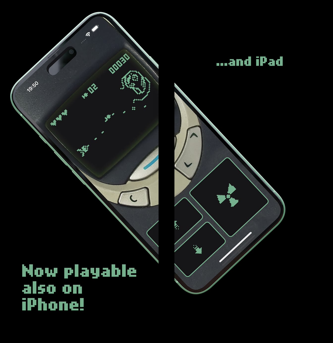
Panoramic App Store screenshots are one wide design — a background, a headline or a device — cut into several screenshots that line up edge to edge when someone swipes through the gallery. You design a single canvas as wide as all frames together, slice it into exact store-size images, and upload them in order.
Both stores accept them: each slice is an ordinary screenshot that has to meet the normal size rules, and Google Play’s guidelines explicitly allow stylized screenshots that break UI across multiple images. This guide covers the slice sizes, how wide the canvas has to be, where the seams should fall, and how to build a panoramic set without slicing by hand.
What makes a screenshot set panoramic
In a regular set every screenshot is its own card. In a panoramic (also called connected or continuous) set, elements cross the boundary between frames: a gradient flows from one image into the next, a phone sits half in frame 2 and half in frame 3, or a line of copy leads the eye to the right. The effect is a hint that there is more to see, which invites a swipe.
The store does not know your set is panoramic. It shows separate images with its own spacing between them, so everything that makes the panorama work has to be planned on your side: exact slice widths, the gap the gallery adds, and an order you will not change without re-slicing.
Panoramic screenshot sizes for each store
Every slice must be an accepted screenshot size on its own. The panorama is only the canvas you cut them from. These are the limits that matter, from Apple’s App Store Connect screenshot specifications and Google’s Play Console Help (October 2026):
| Store / device | Slice size (portrait, px) | Max images | Formats |
|---|---|---|---|
| App Store, iPhone with Dynamic Island (medium display) — required | 1206 × 2622 or 1179 × 2556 | 10 per device size | JPEG, JPG, PNG |
| App Store, iPhone with Dynamic Island (large display) | 1320 × 2868, 1290 × 2796 or 1260 × 2736 | 10 per device size | JPEG, JPG, PNG |
| App Store, iPad 13″ (if the app runs on iPad) | 2064 × 2752 or 2048 × 2732 | 10 per device size | JPEG, JPG, PNG |
| Google Play, any device type | 320–3840 px per side, long side ≤ 2× short side | 8 per device type | JPEG or 24-bit PNG (no alpha) |
How wide the panoramic canvas has to be
The canvas width is the slice width times the number of frames, plus any gap you leave between frames. With no gap, three 1206 px slices need a 3618 px canvas. Apple’s specifications do not publish the spacing the gallery puts between screenshots, so many designers leave an empty gutter of a few percent of the slice width; that strip is never exported, and the visible parts of a device that crosses it still line up once the store adds its own spacing.
Every slice must come out at exactly the accepted size. A canvas that is a few pixels off produces a slice App Store Connect rejects, or, after rescaling, a seam where the background no longer meets. The full list of accepted variants is in our App Store and Google Play screenshot sizes guide.
| Slices | Slice width (px) | Gap | Canvas width (px) |
|---|---|---|---|
| 3 | 1206 | none | 3618 |
| 3 | 1206 | 5% (60 px × 2) | 3738 |
| 5 | 1320 | none | 6600 |
| 5 | 1320 | 5% (66 px × 4) | 6864 |
Design rules for seams and slices
A panorama is only seen whole by people who swipe through every frame. Apple notes that the first one to three screenshots appear in search results when no app preview is available, depending on orientation, so the opening frames carry most of the work. Design each slice so it still makes sense on its own:
- Put the main value proposition fully inside frame 1. Do not let the first headline or the hero device run off its right edge.
- Keep text away from the seams. A word split across two images is unreadable in search results, where frames appear small and apart.
- Let backgrounds, shapes and secondary devices cross the seams. They create the continuity without hiding information.
- Check every slice on its own at a small size. If one only makes sense next to its neighbour, rework it.
- Lock the order before slicing. Swapping two screenshots later breaks every connection on both sides.
- Repeat the rhythm, not the layout. One crossing element per seam is usually enough; more makes the gallery look cluttered.
Panoramic screenshots on Google Play
Google’s Play Console Help explicitly allows stylized screenshots that break UI across multiple uploaded images, but asks developers to prioritize real UI in the first three screenshots. A panorama that is all artwork and no app interface works against that advice.
For eligibility in Google Play’s recommendation formats, apps need at least four screenshots at a minimum of 1080 px, for example 9:16 portrait at 1080 × 1920 or larger. A four-slice panorama at 1080 × 1920 meets that. The other file rules are in our Google Play screenshot requirements guide.
How to make panoramic screenshots in Ecranify
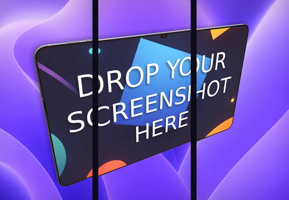
In the Ecranify editor a panorama is one scene. Turn on carousel export, choose 2 to 5 frames and the slice size, and the editor shows the frame boundaries over the canvas so you can place a 3D device or headline across a seam deliberately.
The gap between frames is a slider (5% of the slice width by default, 0–15%). The gutter is shown as a darkened band in the editor and is left out of the export, so every frame still comes out at exactly the slice size. Text and 2D images that span several frames are drawn into each frame they cross.
The export produces one image per frame, which you can download together as a ZIP and upload in order. Carousel export and custom sizes such as 1206 × 2622 are part of the full editor, where you pay per exported render; the free editor exports single screenshots at preset sizes. For the layout side of a set, see our App Store screenshot best practices.
Test a panorama before you commit to it
A connected set is not automatically better than separate cards. It costs more to change, and its benefit depends on how far people swipe. Both stores let you measure it: Product Page Optimization in App Store Connect tests alternative screenshot sets against your original, and store listing experiments in Play Console do the same for Google Play.
Test one variable at a time: the panoramic set against the same screens as separate cards, with the same first-frame headline. If the panorama wins, the continuity helped; if not, the first frame was carrying the result anyway.
Build these in Ecranify
Frequently asked questions
Related guides & comparisons
Build a panoramic set without slicing by hand
Compose the strip as one 3D scene, set the frames and the gap, and export every slice at the exact store size.