iPhone 18 Pro and the iPhone Duo: what Apple's first foldable means for your App Store screenshots
On September 9, 2026, Apple announced the iPhone 18 Pro, the iPhone 18 Pro Max and its first folding iPhone. The foldable is officially called the iPhone Duo — not the "iPhone Ultra" or "iPhone Fold" that most reporting had settled on. For app developers the interesting part is not the titanium hinge. It is that a device which changes shape in your hand breaks the single assumption every App Store screenshot has been built on for fifteen years: that a screen has one size.
This guide has been updated after the event. It leads with what Apple confirmed, flags which pre-announcement rumours were wrong, and then works through the question Apple did not answer on stage — what App Store screenshots for a foldable iPhone will actually have to look like.
Update — September 9, 2026: Apple announced the iPhone Duo
Apple's "Surprise and shine" event confirmed three phones: the iPhone 18 Pro (6.3″), the iPhone 18 Pro Max (6.9″), and the iPhone Duo, a book-style foldable with a roughly 7.6″ inner display that opens out of a roughly 5.4″ cover display. The iPhone 18 Pro models went on sale September 18, 2026; the iPhone Duo follows on October 23, 2026, with pre-orders from October 16. There is no standard non-Pro iPhone 18 this year — those models are expected in spring 2027.
The short version for your store listing: the iPhone 18 Pro family changes nothing you have to act on, and the iPhone Duo is a real new form factor but Apple did not ship a foldable App Store screenshot slot alongside it. The rest of this guide is unchanged in its reasoning — only now the hardware is fact rather than rumour.
| Point | Pre-event rumour | Confirmed at the event |
|---|---|---|
| Name | "iPhone Ultra" / "iPhone Fold" | iPhone Duo |
| Inner display | ~7.8″, 2,713 × 1,920 | ~7.6″, book-style, roughly 4:3 |
| Cover display | ~5.5″, 2,088 × 1,422 | ~5.4″ |
| On sale | September–October 2026, US first | October 23, 2026 (pre-orders October 16) |
| Biometrics | Touch ID power button, no Face ID | Confirmed — Touch ID in the side button |
| Thickness | ~4.5 mm open | Confirmed — 4.5 mm open, Apple's thinnest iPhone |
| SIM | Not discussed | eSIM-only worldwide — no physical SIM tray in any market |
| Front camera | Hole-punch on both screens | Under-display camera on the inner screen, plus a corner selfie camera |
| Starting price | Roughly $2,000–2,400 | $1,999 for 256 GB (up to ~$3,199 for 2 TB) |
When the iPhone 18 Pro and iPhone Duo go on sale
Apple confirmed the dates on stage. The iPhone 18 Pro and iPhone 18 Pro Max opened for pre-order on Friday, September 12 and went on sale Friday, September 18, 2026 in more than 65 countries. The iPhone Duo is on a separate, later track: pre-orders from Friday, October 16, retail availability Friday, October 23, 2026.
The split matters for planning because it is two screenshot-refresh moments in one product cycle, not one. And with the non-Pro iPhone 18 held back to spring 2027, there is a third moment still to come.
| Milestone | Date | Status |
|---|---|---|
| "Surprise and shine" keynote | September 9, 2026 | Happened |
| iPhone 18 Pro / Pro Max pre-orders | September 12, 2026 | Confirmed |
| iPhone 18 Pro / Pro Max on sale | September 18, 2026 | Confirmed |
| iPhone Duo pre-orders | October 16, 2026 | Confirmed |
| iPhone Duo on sale | October 23, 2026 | Confirmed |
| iPhone 18 (standard, non-Pro) | Spring 2027 | Expected |
iPhone 18 Pro: still a marketing refresh, not a compliance one
For screenshot purposes the iPhone 18 Pro is a non-event, and the event confirmed it. The Pro keeps the 6.3″ display and the Pro Max the 6.9″ display — the same sizes as the iPhone 17 Pro generation. Face ID and the Dynamic Island both stay; the Island is smaller and now shows up to three simultaneous Live Activities. The headline changes are internal: the A20 Pro chip on a 2nm process, Apple's C2 modem, a variable-aperture main camera, storage up to 2 TB for the first time, and a new Burgundy colour. Prices rose $100 across the line.
Practically: if your listing already uses the 6.9″ App Store slot at 1320 × 2868 px, the iPhone 18 Pro Max does not force you to re-export anything. What changes is the mockup — a listing that shows last year's handset, or a wider Dynamic Island, reads as slightly stale to a shopper holding this year's. That is a marketing refresh, not a compliance one.
- Display sizes unchanged: 6.3″ Pro, 6.9″ Pro Max — existing 1320 × 2868 exports stay valid.
- Smaller Dynamic Island (now three Live Activities) — a detail in the device frame, not a canvas-size change.
- New Burgundy colour and a slightly thicker camera plateau are the visible design deltas worth reflecting in a mockup.
- Prices up $100 and a 2 TB tier — the polish bar on a listing goes up with the price.
iPhone Duo: the foldable, by the numbers
The folding iPhone is the one that matters here, and Apple filled in the specifics. It is a book-style fold: a roughly 7.6″ inner display — closer to an iPad's 4:3 than to any iPhone aspect ratio — opening out of a roughly 5.4″ cover display, with a crease Apple describes as nearly invisible when unfolded. At 4.5 mm open it is the thinnest iPhone Apple has made, in a titanium-and-aluminium frame on a liquid-metal hinge.
Two confirmed details reshape every mockup of this device. Biometrics: there is no Face ID — the iPhone Duo uses Touch ID built into the side button, like an iPad. And it is eSIM-only in every market, so there is no SIM tray anywhere on the body. The inner selfie camera sits under the display; a second camera is in the corner. Every screenshot you draw of this device needs a different front-face and edge story than any current iPhone.
| Spec | Confirmed value |
|---|---|
| Inner display | ~7.6″, book-style, roughly 4:3 |
| Cover display | ~5.4″ |
| Thickness | 4.5 mm open (Apple's thinnest iPhone), ~9–9.5 mm closed |
| Frame / hinge | Titanium and aluminium, liquid-metal hinge, "nearly invisible" crease |
| Biometrics | Touch ID in the side button (no Face ID) |
| SIM | eSIM-only worldwide — no physical SIM tray |
| Cameras | 48 MP Dual Fusion rear (main + ultra-wide, no telephoto); under-display inner camera + corner selfie camera |
| Chip / RAM | A20 Pro (2nm), 12 GB |
| Accessory | Apple Pencil (USB-C) support on both displays |
| Price | $1,999 for 256 GB, up to ~$3,199 for 2 TB |
| On sale | October 23, 2026 (pre-orders October 16) |
Why a folding iPhone breaks the screenshot model
Every App Store screenshot slot today is a fixed pixel rectangle tied to a device class. You design one 1320 × 2868 image, Apple scales it down for older iPhones, done. A foldable has two screens with two different aspect ratios and a live transition between them — and Apple's own iPhone Duo developer material tells developers to stop designing around fixed screen assumptions and let interfaces resize fluidly. Apple published tech-talk sessions ("Design for iPhone Duo", "adaptive layouts on iPhone Duo", "multiple displays and scenes on iPhone Duo") the same week, with a dedicated Human Interface Guidelines document to follow.
That guidance is about your app's UI. But your store listing is the first screen a buyer sees, and it has the same problem one level up: a screenshot that shows a tall narrow phone UI tells an iPhone Duo owner nothing about what your app does with 7.6 inches. Conversely, a screenshot that only shows the expansive unfolded layout misrepresents the app for the majority of buyers on a normal iPhone.
What App Store screenshots for the iPhone Duo could look like
Apple did not announce a new App Store Connect display class for the iPhone Duo at the event — it pointed developers at adaptive-layout sessions and a forthcoming iPhone Duo Human Interface Guidelines document instead. So this is still open, and what follows is reasoning from precedent rather than fact. There are three plausible outcomes, and they are worth designing against now because the work is nearly identical in each case.
The most likely, based on how Apple handled the 6.9″ transition, is that the iPhone Duo initially inherits scaled 6.9″ screenshots and a dedicated slot appears only once the device has meaningful install base. The second possibility is a new display class in App Store Connect at the inner panel's native resolution. The third — and the one that would actually serve shoppers best — is a slot that expects the unfolded canvas, with a separate optional cover-screen size.
| Scenario | What you would upload | What it means for you |
|---|---|---|
| Scaled from 6.9″ | Nothing new — 1320 × 2868 as today | Zero compliance work; your listing simply looks narrow on a 4:3 screen |
| New inner-display class | A portrait image at the inner panel's ~4:3 native resolution | A second full design pass at an iPad-like aspect ratio |
| Inner + optional cover slot | One unfolded ~4:3 image plus one narrower cover-screen image | Two crops per frame; the story has to work at both widths |
How to design a screenshot that survives a fold
Whichever slot Apple ships, the design constraints are already predictable, and they are the same constraints Android developers learned on the Galaxy Z Fold. Composition has to tolerate a change of aspect ratio without the message falling apart.
The single most useful habit is to design the message and the device frame as separable layers. A headline anchored to the top of the canvas and a device mockup anchored to the bottom will re-flow into a wider frame; a full-bleed illustration where text is baked into the artwork will not.
- Keep headlines in the top third and short enough to survive a 30–40% width change without rewrapping.
- Show the fold. A frame where the device is open, with content spanning both halves, communicates "this app uses your big screen" faster than any caption.
- Use at least one frame showing the cover screen, so buyers understand the app works closed too.
- Avoid putting anything critical along the vertical centre line of an unfolded mockup — the crease still reads visually even though Apple calls it nearly invisible.
- Design the carousel story so it still makes sense if a frame is cropped: the first frame must carry the value proposition alone.
- Do not bake device chrome into your captured screen image. Capture the raw UI and add the frame separately, so the same capture can be re-framed for a different body.
What Apple confirmed, and what is still open
After the event the hardware is settled: the iPhone Duo name, the ~7.6″ inner and ~5.4″ cover displays, the 4.5 mm open thickness, Touch ID in the side button, eSIM-only, the under-display inner camera, the $1,999 starting price and the October 23 on-sale date are all confirmed by Apple. The earlier "iPhone Ultra" name, the ~7.8″ / 5.5″ display figures and the ~$2,400 starting price were the rumours that missed.
What is still open is the store side. Apple has not published an App Store Connect screenshot size or display class for the iPhone Duo. The safe planning position is unchanged: treat the iPhone 18 Pro refresh as near-zero-effort, treat a foldable screenshot slot as a maybe that costs you one extra design pass, and build both from source files you can re-export rather than from flattened images you would have to redraw.
Where Ecranify already fits
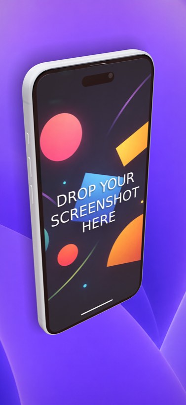
For the iPhone 18 Pro family, nothing about your workflow changes. Because the Pro and Pro Max keep the 6.3″ and 6.9″ display sizes, the App Store export presets you use today — 1320 × 2868 for the mandatory 6.9″ slot — stay valid, and Ecranify's existing iPhone Pro Max mockups work out of the box. Swap in a fresh screen capture, re-export, done; adjust the device colour to the new Burgundy if you want the mockup to read as current.
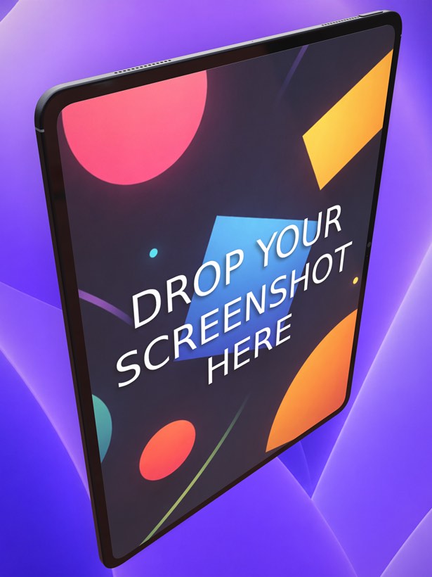
The iPhone Duo is the more interesting case, and it is exactly the case a parametric tool is built for. Devices in Ecranify are not fixed 3D models — every mockup is generated from parameters: body width, height and depth, corner radius, edge bevel, front-face inset, plus positioned features like the camera lens, display cutout, Dynamic Island, buttons, speaker grills and custom decals. Building a new device means changing numbers, not modelling a mesh.
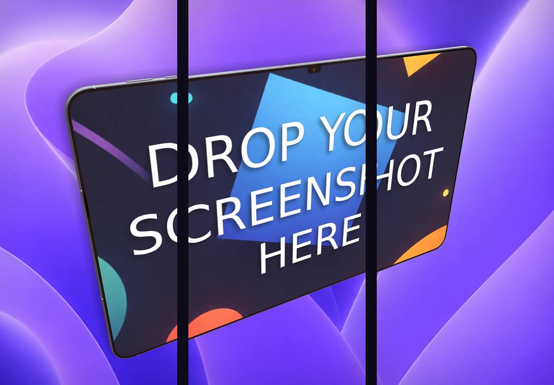
So recreating the iPhone Duo's unfolded body is an afternoon of slider work rather than a wait for someone else to publish a template: set the ~4:3 unfolded body dimensions, dial in the 4.5 mm profile, place the under-display camera, drop the SIM tray entirely (it is eSIM-only), move Face ID off and Touch ID onto the side button, and export at whatever size App Store Connect ends up asking for. Whatever Apple's first folding iPhone needs from your listing, the tool does not need a hardware update before you can mock it up.
Build these in Ecranify
Frequently asked questions
Related guides & comparisons
Ready for the iPhone 18 Pro — and the iPhone Duo
Ecranify ships current iPhone Pro Max mockups with App Store export presets built in, and its parametric device editor lets you build the iPhone Duo's unfolded body yourself. Free to start.