How to make App Store screenshots (step by step)
Your app store screenshots are the most important marketing assets you have. Studies show that over 70% of users decide whether to download an app based entirely on its screenshots, without ever reading the description. Creating app store screenshots that convert requires a mix of clean UI, clear benefits, and professional design.
This step-by-step app store screenshot tutorial will walk you through exactly how to create compelling, high-converting screenshots for iOS and Google Play—from capturing your best screens to exporting all required sizes in minutes.
Why App Store screenshots matter for conversion
The App Store and Google Play are highly visual platforms. When users search for an app, the first three screenshots dominate the screen. Over 70% of users make their download decision based entirely on these images. If your screenshots look unprofessional or fail to explain what the app does, users will bounce to a competitor.
Good screenshots do more than just show the UI—they tell a story, highlight key benefits, and build trust before the app is even opened.
Understand Apple and Google requirements
Before designing, it is crucial to understand the rules. Both stores have strict requirements for dimensions, formats, and aspect ratios. For example, Apple requires the 6.9″ iPhone size, while Google Play is more flexible but strict on aspect ratio. For a complete list of required dimensions, check out our App Store screenshot sizes guide.
Generally, design for the largest required size (like 1320 × 2868 for iOS) and let the stores or your export tool scale them down for older devices.
Step 1: Capture your best screens
Start by taking clean, high-resolution screenshots of your app’s most important features. Avoid cluttered screens or deep settings menus. Instead, focus on the "aha moments"—the screens where your app delivers the most value.
Make sure to hide the status bar (time, battery, signal) or use a clean status bar tool, as messy notifications look unprofessional. Consider whether light or dark mode suits your brand better, and stick to one theme consistently across the set.
Step 2: Choose a device frame
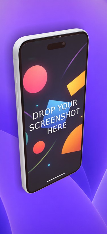
Raw, flat screenshots rarely convert as well as framed ones. Placing your UI inside a device frame provides context and makes the app look tangible. 3D device mockups are particularly effective because they add depth, premium lighting, and dynamic angles that flat vector frames cannot match. If you currently use a flat-frame template tool, our AppMockUp alternative comparison shows what changes when you move to 3D.
Tools like Ecranify allow you to drop your UI into high-quality 3D iPhone and Android models, instantly elevating the perceived value of your app without requiring complex 3D software. If you are choosing between 3D mockup tools, our Ecranify vs Rotato comparison covers the trade-offs.
Step 3: Add headlines and backgrounds
Do not rely on your UI to explain itself. Add a short, bold headline above or below the device in each frame. The golden rule of copywriting here is: focus on benefits, not features. Instead of "Advanced Task Filtering," write "Find what matters, faster."
Use contrasting background colors to make the device and text pop. A subtle gradient or a solid brand color works best. Ensure the text is large enough to read easily on a small mobile screen.
Step 4: Design a carousel flow
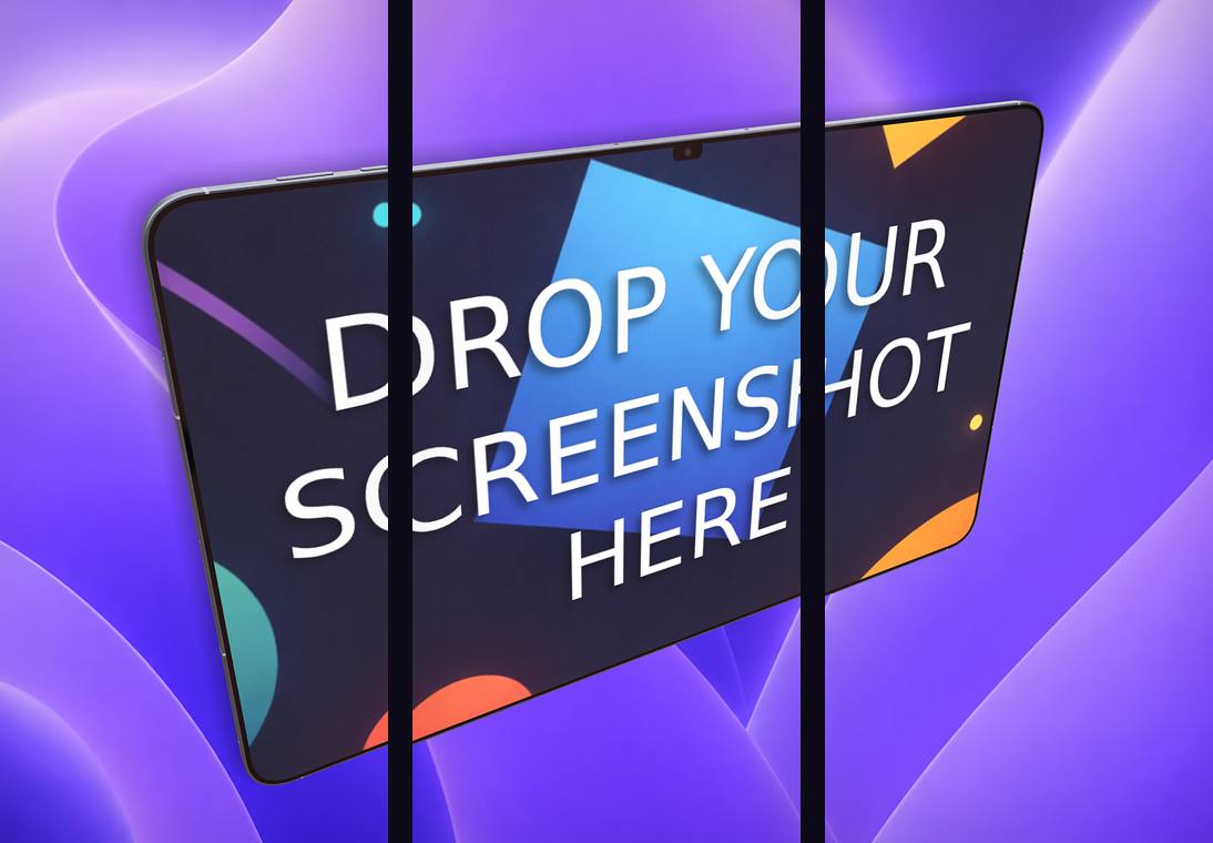
Modern store listings often use a connected carousel design, where a single background or a 3D device spans across multiple screenshot frames. This encourages users to swipe through the gallery, increasing engagement and the chance of a download.
By telling a continuous story across the frames, you keep the user interested. If you use Figma for UI design, you can read our Figma to App Store screenshots workflow on how to integrate your designs into a seamless carousel strip.
Step 5: Export in all required sizes
Manually resizing your design for the 6.9″ iPhone, 6.5″ iPhone, iPad, and various Android tablet sizes is tedious. The final step is exporting your composition into the exact dimensions required by the App Store and Google Play.
Ecranify simplifies this with built-in multi-size export presets. Design your layout once, select the required devices, and export a complete, store-ready package in a single click.
Common mistakes to avoid
When you create app store screenshots, watch out for these conversion-killers:
- Using raw UI screenshots with no text or device frame context.
- Writing long, small paragraphs of text that are impossible to read on mobile.
- Forgetting to update the screenshots when the app’s UI drastically changes.
- Cluttered status bars showing low battery or irrelevant notifications.
- Placing important text at the very edges where it might get cropped by smaller screens.
Build these in Ecranify
Frequently asked questions
Related guides & comparisons
Create App Store screenshots that convert
Use Ecranify’s 3D device mockups, carousel maker, and one-click store exports to design your perfect App Store and Google Play listing.