New devices, new screenshots, zero marketing: 80% more downloads in 13 weeks
This is a small, real number from App Store Connect, not a projection or an agency case study written to sell you something: over a 13-week window, downloads for a tiny paid Apple Watch game rose 80% after exactly two changes — the app gained iPhone and iPad support, and its App Store screenshots were rebuilt from scratch in Ecranify. Nothing else about the app’s marketing changed in that window, which is what makes the number worth writing up: there is no ad spend, no press hit and no influencer post competing for credit.
We will get to the actual figures shortly, and — full disclosure — they are small enough that you could plausibly print the download list on an index card. That is the point, not a caveat: the mechanism behind an 80% jump does not care whether the starting line is 9 downloads a week or 9,000.
The app: a paid nostalgia trip, built first for Apple Watch
Space Impact Watch is a faithful little remake of Space Impact, the missile-dodging shooter bundled with Nokia 3310-era phones, rendered in the same chunky green monochrome LCD look. It is a paid download — no ads, no in-app purchase funnel to fall back on if the store listing does not sell the app — and it was originally built exclusively for Apple Watch, a screen almost no screenshot tool or store-optimization guide pays attention to.
A paid app with no free tier and no algorithmic feature placement has essentially one sales pitch available to it: the product page. Nobody who lands there has been softened up by a free trial. Whatever convinces them has to happen in the app icon, the screenshots, and the first line of the description — which makes this app an unusually clean test bed for how much the screenshots themselves are actually doing.
What actually changed — two things, nothing else
Two changes shipped together. First, native iPhone and iPad support: a game that had only ever been playable on a Watch became playable on the two devices that essentially everyone browsing the App Store is holding. That alone widens who the listing is even relevant to — you stop pitching “a Watch app” to the sliver of shoppers filtering by Watch compatibility and start pitching “a game” to anyone scrolling on their phone.
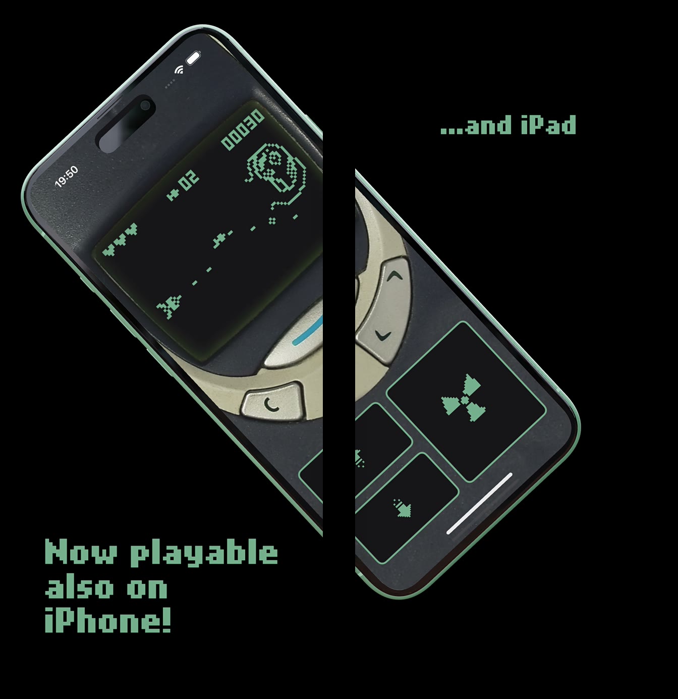
Second, the entire screenshot set was rebuilt in Ecranify to actually show that. The same warm, pixel-green Nokia aesthetic was carried over onto 3D iPhone and iPad mockups, and — because the composition allowed it — a connected two-frame carousel was built where the phone visually runs off the right edge of the first screenshot and continues into the second, the kind of alignment that is fiddly to pull off by hand and exactly what a carousel export exists to automate.
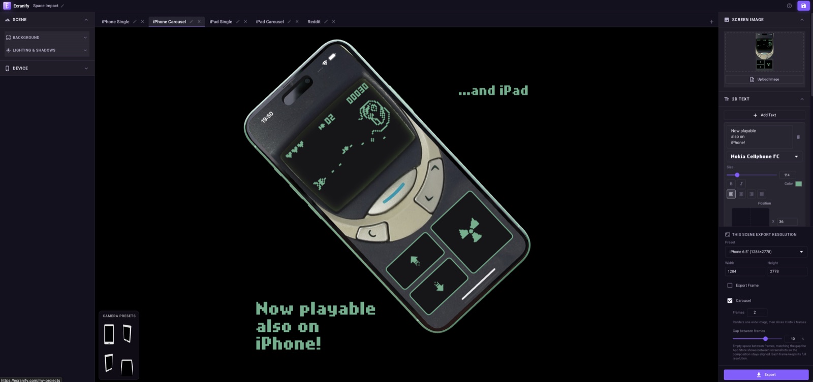
What that looked like in the editor
One Ecranify project holds every version needed for the update: a single iPhone screenshot, a single iPad screenshot, and a two-frame carousel for each, all sharing the same background, device finish and headline styling so the whole set reads as one coherent listing rather than a pile of separate exports.
The result, in App Store Connect’s own numbers
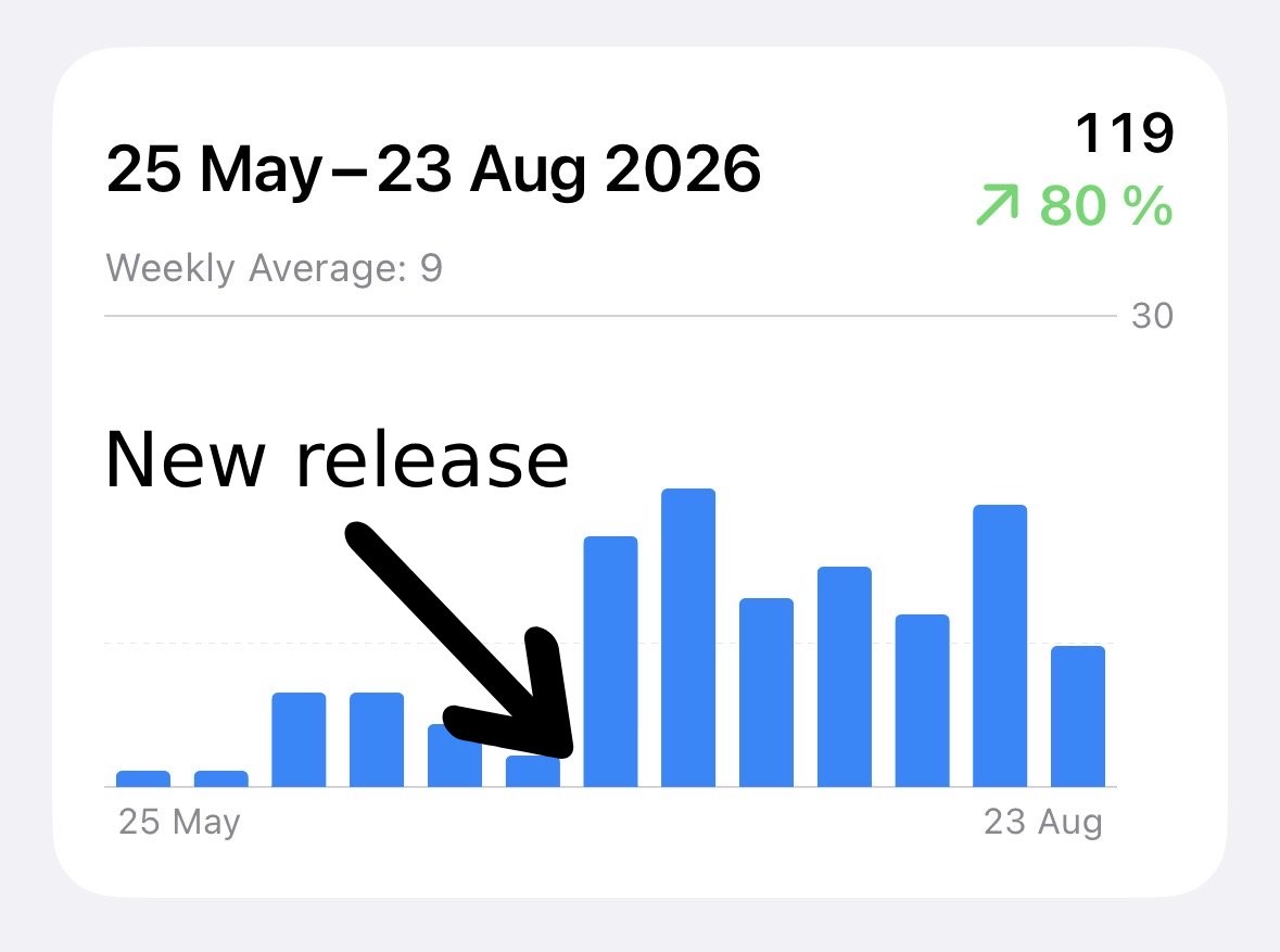
App Store Connect’s Downloads chart for the 13-week window from May 25 to August 23, 2026 shows 119 total downloads, a weekly average of 9, and an 80% increase over the prior comparable period. The chart itself marks the exact week the update — iPhone/iPad support plus the new screenshots — went live, and every week after that point sits visibly above every week before it; the step is not a gradual drift, it lines up with the release.
Let’s be honest about scale: 119 downloads over three months will not fund a sequel, and a 9-per-week average is the kind of number where you could plausibly recognize repeat visitors. But imagine the same shape on an app with a mainstream baseline — a title pulling a few thousand downloads a week instead of nine. The identical 80% step would read as a genuinely large growth event, the kind that gets a screenshot of its own in an investor update. The absolute numbers here are just this particular app being extremely, deliberately niche. The mechanism producing the 80% is the interesting part, and it does not scale with audience size.
Why it is fair to credit the listing, not something else
The reason this number is usable at all is what did not happen in the same window: no paid user acquisition ran, no press or blog coverage picked the app up, no creator or community post drove a traffic spike, Apple did not feature it, and the price did not change. The only content update in the release was the device support the new screenshots exist to communicate — there is no second variable competing for credit.
App Store discovery for an unfeatured paid app is still overwhelmingly search and browse, and for both, the product page — icon, screenshots, description — is the entire pitch a shopper sees before deciding. With every other lever untouched, the two changes above are the only credible explanation for a step change that lines up exactly with their release date.
What made the new screenshots different
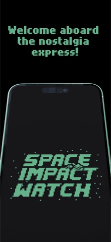
The design choices were small but consistent. A black background makes the green LCD screen the only thing your eye can land on — there is nothing else in frame competing with it. The device frame stayed on-brand rather than generic: the same pixel typeface used in the game’s own UI carries into the headline text, so the screenshot looks like an extension of the app rather than a marketing template dropped on top of it. And the connected carousel — the Nokia phone bleeding off the edge of frame one and reappearing in frame two next to the Apple Watch it started on — visually tells the “also on iPhone, also on iPad” story in a way a caption alone would have to spell out.
None of this required new photography or a designer starting from a blank canvas per device: the iPad screenshot is the iPhone composition duplicated into a bigger frame, and the carousel is the single-frame composition sliced across two store-ready exports by Ecranify’s carousel export rather than laid out frame-by-frame by hand.
The takeaway for an app with a marketing budget of zero
Most small apps do not have a press contact or an ad budget to test with — the store listing is one of the only levers fully in your control that a shopper actually sees before they decide, and industry research consistently puts screenshots as the single biggest factor in that decision. If your app has a natural next platform (a Watch app that could run on the phone, a phone app that could run on a tablet), widening device support and refreshing the screenshots to actually show it are cheap enough to ship together and honest enough to attribute afterward.
- If there is a natural next platform for your app, ship it — it widens who the listing is relevant to before a single pixel of the screenshots changes.
- Refresh the screenshot set the moment device support changes; a listing that only shows the old platform undersells what you just built.
- Use a connected carousel where the composition allows it — it reads as more deliberate and polished without any new photography.
- Ship the device update and the new screenshots together, then hold everything else steady for a few weeks so you get one clean before/after step instead of a blur of causes.
- Write down what else did or did not happen in that window (ads, press, features, price) — that record is the only reason a result like this is attributable instead of a guess.
Build these in Ecranify
Frequently asked questions
Related guides & comparisons
Turn a platform launch into a listing that matches it
When your app gains a new device, Ecranify lets you duplicate the scene you already have instead of starting over — same background, same device finish, a new export size. Free to start.