App Store screenshot best practices: what actually converts
You already know your App Store screenshots matter — they are the single biggest factor in whether someone taps “Get.” But knowing they matter and knowing what actually works are two different things. This guide distills the best practices that consistently drive higher conversion rates, drawn from ASO research, Apple's own guidance, and patterns we see across thousands of store listings.
If you want the step-by-step process for creating screenshots from scratch, start with our how-to guide. This page focuses on the design and strategy decisions that separate high-converting listings from forgettable ones.
Lead with your strongest screenshot
The first screenshot gets 10× more views than the last. On the App Store, the first two to three frames are visible without scrolling in search results — and most users never swipe further. Your best feature, your clearest benefit, or your most eye-catching design should always be in frame one.
A common mistake is opening with a splash screen or logo. Users already know the app name — they want to see what it does. Lead with the screen that shows your core value proposition in action.
Write benefit-led headlines, not feature lists
Every screenshot should include a short, bold headline — but the wording matters enormously. Features describe what the app does (“Advanced filtering options”); benefits describe what the user gets (“Find exactly what you need, instantly”).
Keep headlines to one line. Use large, high-contrast text that is legible at thumbnail size on a phone screen. If the text is hard to read when the screenshot is the size of a postage stamp, it is too small or too long.
Design for thumbnail size first
Most users see your screenshots at roughly 1 cm wide in search results. At that size, the fine details of your UI are invisible — what remains are colors, shapes, device angle, and headline text.
Design with this constraint in mind: bold backgrounds, high contrast between device and background, and headlines that are readable even at small sizes. Test by zooming your design out to 20% — if you can still read the headline and understand the frame, it works.
Tell a story across the carousel
The highest-converting listings use their screenshot set as a narrative arc, not a random collection of screens. A common pattern: frame 1 = hero benefit, frames 2–4 = supporting features, frame 5 = social proof or trust signal (reviews, awards, “trusted by X users”).
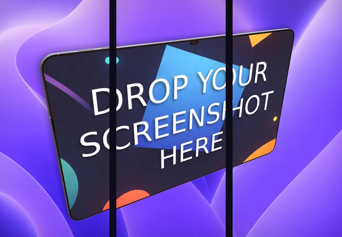
Connected carousel designs — where a single background or device spans across frames — are particularly effective because they create visual continuity that encourages swiping. Ecranify's carousel export makes this easy to produce and slice into individual store-ready frames.
Localize for your top markets
If your app earns revenue in multiple countries, localizing your screenshots is one of the highest-ROI ASO activities. At minimum, translate the headline text in each frame. For maximum impact, localize the UI screenshots themselves — users notice when the app is shown in their language. Some screenshot tools build localization in; our Screenshots Pro comparison looks at one of them.
Apple supports up to 10 screenshots per localization, and Google Play supports the same per language. Prioritize by revenue: if Japan and Germany are your top non-English markets, start there.
Dark mode vs. light mode
There is no universal winner. Dark backgrounds make device screens pop and feel premium. Light backgrounds feel clean and approachable. The best choice depends on your app's brand and your audience.
One useful test: if your app's UI is primarily light, a dark screenshot background creates contrast that makes the device stand out. If your UI is dark (like a photo or video editor), a lighter background prevents the frame from feeling too heavy. Whatever you pick, stay consistent across all frames.
Don't skip iPad screenshots
If your app supports iPad, Apple requires iPad 13″ screenshots (2064 × 2752 px). Many developers upload the same phone screenshots stretched or leave the iPad slot empty — both are missed opportunities.
iPad users convert at a higher rate when they see the app displayed on a tablet. Show how your app takes advantage of the larger screen — split views, sidebars, and detailed layouts are all worth highlighting. Our screenshot sizes guide has the exact dimensions.
A/B test with Product Page Optimization
Apple's Product Page Optimization (PPO) lets you test up to three screenshot treatments against your default, with real traffic split. Google has similar Experiments in the Play Console.
Test one variable at a time for clean results: a different first screenshot, a different headline style, or a different background color. Run the test for at least 7 days and use statistical significance (not gut feeling) to pick the winner. Even a 5% improvement in conversion rate compounds into thousands of additional installs over time.
Common mistakes that kill conversion
These patterns consistently underperform — avoid them:
- Opening with a logo, splash screen, or “welcome” frame instead of showing the app in action.
- Using tiny text that is unreadable at thumbnail size in search results.
- Showing raw UI with no device frame, headline, or background context.
- Inconsistent visual style across frames — mixing fonts, colors, or device orientations.
- Uploading identical screenshots for phone and tablet instead of showcasing each device's strengths.
- Never updating screenshots after a major redesign — stale screenshots erode trust.
Build these in Ecranify
Frequently asked questions
Related guides & comparisons
Design screenshots that convert
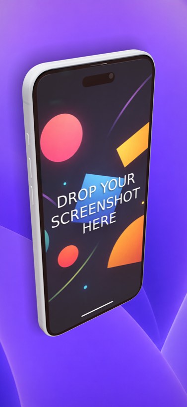
Apply these best practices in Ecranify — 3D device mockups, headline text, connected carousels, and one-click multi-size export. Free to start.